Blog
Where Veteran Care is a Top Priority
Read More
Blog

The 4th of July fireworks and small-town parades are over, and America has officially turned 250. Generational milestones like this are a good moment to reflect on how the country feels about itself.
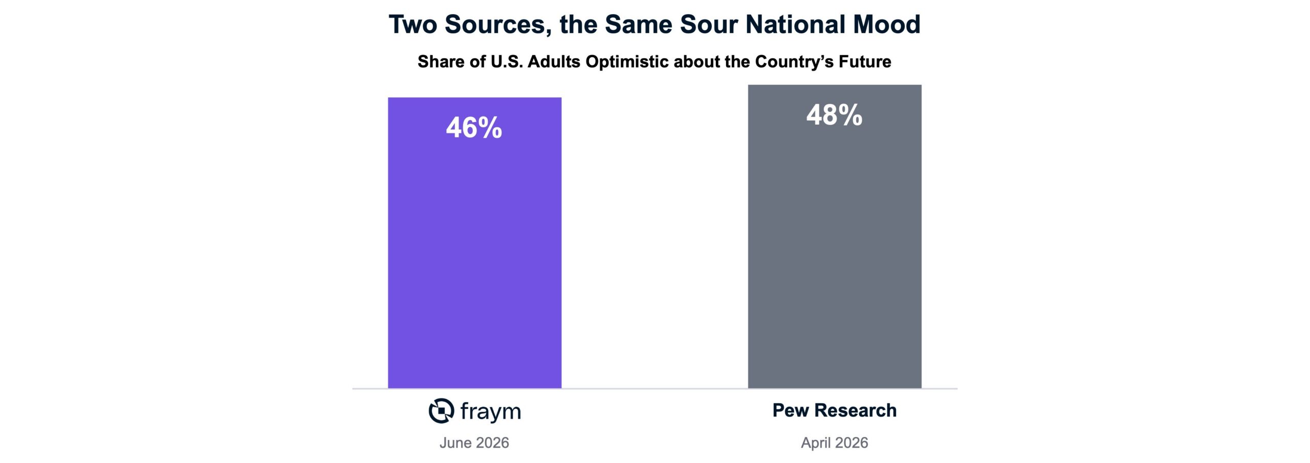
Pew Research recently offered a thoughtful answer in an informative report — On the Country’s 250th Anniversary, the American People Are in a Sour Mood. Their findings paint an introspective portrait of a nation feeling blue on a big birthday:
• Only 48 percent of Americans are optimistic about the nation’s future.
• Majorities expect the country to become even more divided in the future.
• A majority believe that America’s best days may be behind it.
At Fraym, we track what Americans think about hundreds of topics every month, and our June numbers tell the same story as Pew. We found that only 46 percent of Americans are optimistic about the country’s future. Less than four in ten feel the country is headed in the right direction, and barely more than a third hold a favorable view of the country right now.
While there are slight differences in our questions and methodology, both Fraym and Pew point to the same conclusion: a sour “national” mood.
Pollsters know that averages hide variation, so they break down topline results into crosstabs. Pew, for instance, slices its national results by age group and political party, revealing striking gaps—satisfaction runs far higher among Republicans than Democrats. This tells us that the national mood depends a great deal on who you are.
But what about where you live?
National statistics don’t speak to the 3,100+ counties, 41,000+ ZIP codes, or 84,000+ census tracts that are home to over 340 million people. Because these geographic insights remain invisible in national polling, we are quietly left to assume that the mood is evenly spread across the map. We act as though the national average applies exactly the same in a Cleveland suburb as it does in rural Georgia or downtown San Francisco.
It isn’t. Not even close.
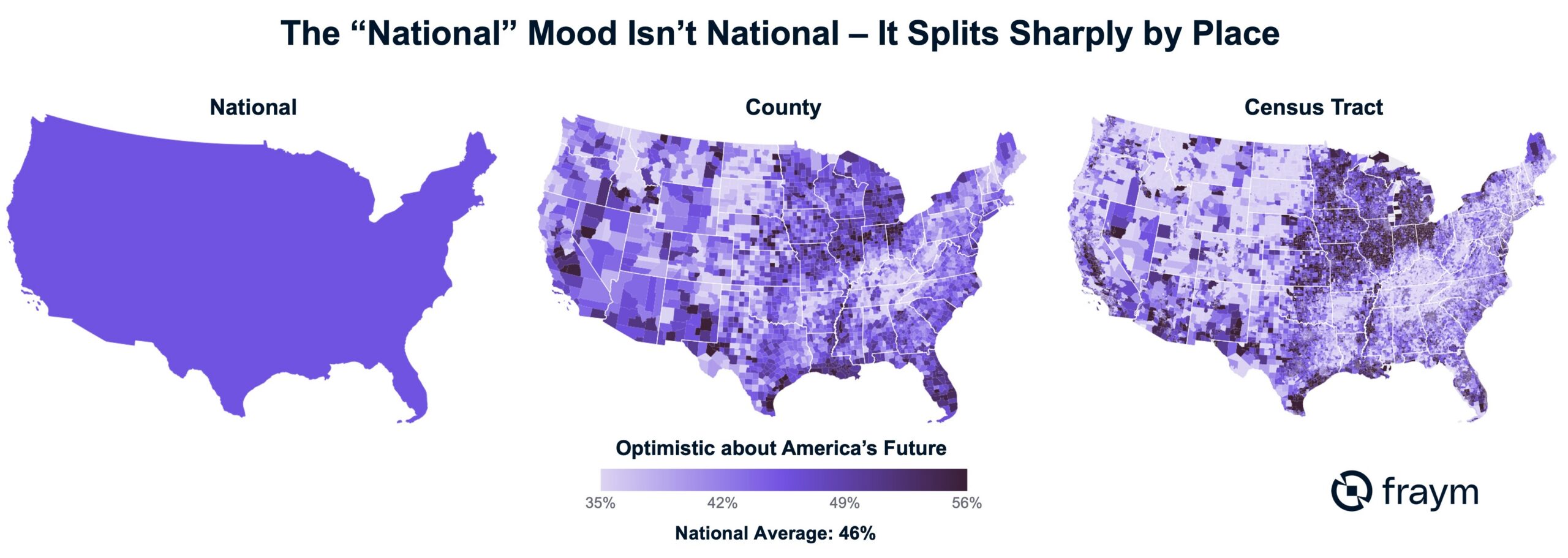
Because Fraym produces localized sentiment data monthly at the state, county, ZIP code, and census tract levels, we can map the same June optimism metric across the country. Watch what happens to that single, “flat” national average as you zoom closer to the ground:
• At the National Level: Optimism sits at 46 percent.
• At the County Level: The range spans from 41 percent to 52 percent (an 11-point spread).
• At the ZIP Code Level: The gap widens to 17 points.
• At the Neighborhood (Census Tract) Level: The spread extends beyond 20 points, with the ends of the spectrum widening further.
The national average is still mathematically correct, but it is a coarse number that lacks practical utility. The closer you look, the more the singular “national mood” fractures into thousands of distinct community and neighborhood-level realities.
Nowhere is that clearer than inside Philadelphia, the very city where the American experiment was signed into being.
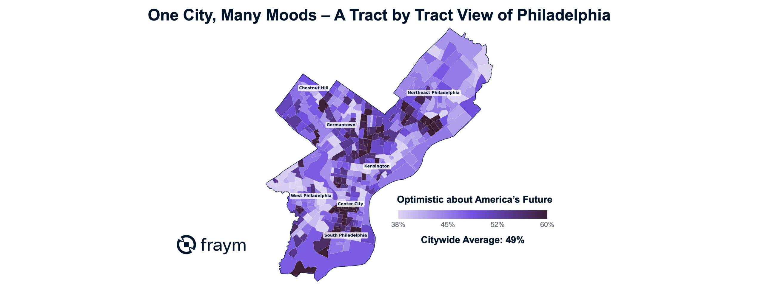
Citywide, 49 percent of Philadelphians are optimistic about the country’s future. But zoom all the way in, census tract by census tract, and that single average dissolves into a highly nuanced, multi-dimensional landscape.
Inside Philly, local optimism runs from 38 percent in some neighborhoods to nearly 60 percent in others – a 22-point swing. Much of it being associated with socio-demographic, affordability, and political drivers.
You can see it in the rowhouse blocks of South Philadelphia, where the mood runs warmer. A few miles north, in Kensington, it runs cooler. Two neighborhoods in the same city, under the same mayor — and living in what might feel like two different worlds.
This variation isn’t a statistical curiosity. The geographic level you can see is the level you can act on.
National statistics are rarely useful in a practical, operational sense. Civic organizations, local governments, and businesses operate at the neighborhood level—yet, historically, that is precisely the level at which sentiment data has been missing. When you can finally see local sentiment clearly, the strategic landscape shifts:
• A Foundation deciding where a community-investment dollar will take root can identify which neighborhoods are ready to build and which need baseline support.
• A Public Health Agency whose outreach lives or dies on local trust can gauge that trust block-by-block, rather than relying on a sweeping national average.
• An Organizer planning a door-knocking campaign can target specific tracts and blocks rather than blanket-bombing an entire ZIP code.
• A Mayor trying to rebuild civic trust can pinpoint exactly which parts of her city have quietly given up on it.
There is no single national mood — there never was. The sour headline is real, but when you zoom in, that lone statistic breaks into thousands of hyper-local truths.
A number you can only track nationally is one you can only worry about in an abstract, helpless way. A number you can map locally is one you can actually do something about. Knowing exactly where hope is holding — and where it has drained away — turns a gloomy statistic into an actionable address.
The nation at 250 doesn’t feel one single way, and it never did. The reward for finally seeing this clearly isn’t a sharper verdict on America. It’s the chance to show up where we are most needed.